This Tool Lets You See COVID Risk In Your Area In Real Time

How likely is it that someone at your Thanksgiving table will have COVID? Use this tool to find out
It’s pretty safe to say that the U.S. has completely lost any handle it has ever had on COVID-19. Infections have soared to more than 100,000 new cases per day. Over 1,000 people per day are dying. Hospitals in many cities are reaching critical shortages of ICU beds. And all of this right before Thanksgiving, when, despite the out-of-control pandemic, 40 percent of Americans still say they plan to travel. Cool, cool, cool.
With this horrifying surge in new cases, hospitalizations, and deaths coming just before the holidays, you might be wondering just how risky your Thanksgiving and Christmas plans may be. And now, there’s a tool for that.
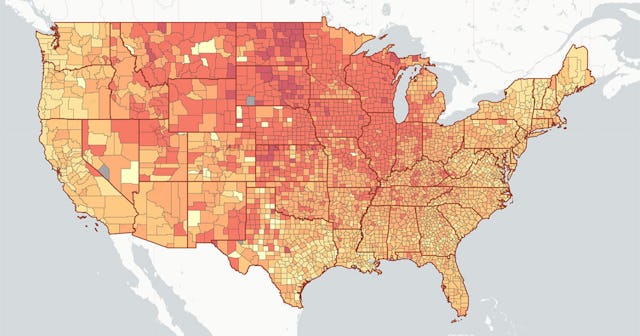
Researchers at Georgia Tech University have created a “COVID-19 Risk Assessment Planning Tool” — a map that allows you to choose any county in the U.S. and a group size to see what the likelihood is that someone at that gathering or event will be infected with the virus.
Let’s look at a few examples. Say you want to attend a 50-person wedding in Portland, Oregon. With a 50-person gathering selected, we hover over Multnomah County, where Portland is located, and the map shows that there’s currently a 41 percent chance that someone at that wedding will have COVID-19.
Now let’s consider a 10-person Thanksgiving dinner in Chicago. We set the group size to 10, and zoom in on Cook County, Illinois. According to the tool, there’s a 29 percent chance that someone in that group of 10 will be infected with COVID-19, based on local case counts.
The tool can be used to estimate the relative risk for just about any event size, and in any location in the country. It calculates risk in real-time using COVID case data from all over the U.S. It can only tell you the risk level of an activity, though — it can’t tell you whether any gathering is too risky to attend. That’s up to you.
“In a way it’s like a weather map,” said Clio Andris, a professor of city and regional planning and interactive computing at Georgia Tech who helped build out the tool. “It can tell you what the risk is that it will rain, but it can’t tell you if you’ll get wet. That depends on if you carry an umbrella, or if you choose not to go outside at all.”
Here’s hoping that this tool will help put the news reports into perspective for people who are thinking about holiday travel this year. The place we’re in now is much, much worse than in the spring, when there were lockdowns, or even over the summer, when a deadly second wave claimed tens of thousands of lives.