What Your Resume Font Says About You

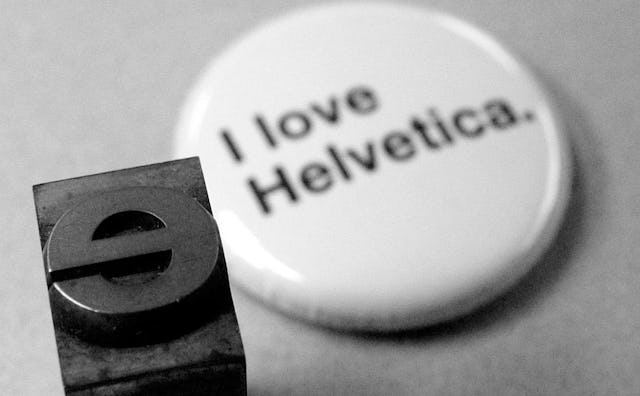
Bloomberg asked a bunch of typography experts to name the top fonts for classing up a resume. No surprise that they all came back with the same unified answer: Helvetica—otherwise known as the graphic designer’s best friend. “Helvetica is so no-fuss, it doesn’t really lean in one direction or another. It feels professional, lighthearted, honest,” said Brian Hoff, creative director of Brian Hoff Design. “Helvetica is beautiful,” added Matt Luckhurst, the creative director at Collins, a brand consultancy, in San Francisco. “There is only one Helvetica.”
OK, so if Times New Roman is the sweatpants of fonts—”It’s telegraphing that you didn’t put any thought into the typeface that you selected” said Hoff—then Helvetica is a perfectly tailored Brioni suit. Got it. But what if you still want to kick things up a little more? Luckhurst recommends Didot, which he calls fancy and feminine—but nonetheless cautions that Didot’s good for landing a gig in fashion but not anywhere else. “It’s like wearing the black dress to the ball,” he says. “Would you wear a tuxedo to your job interview?”
Good point. (And yes, that’s another fashion reference.) Hoff suggests moving outside the standard pull-down menu and purchasing a font like Proxima Nova, which he calls a “cousin” to Helvetica, if you want to make your resume stand out. “Helvetica can be more stiff and Proxima Nova feels a little rounder,” he said. “I never met a client that didn’t like that typeface.”
So which three fonts topped the resume “don’t” list? Zapfino, which Luckhurst dismisses as “too swoosh-y”; Courier (“You don’t have a typewriter so don’t pretend you have a typewriter”); and of course, the notorious Comic Sans, which apparently shouldn’t even be considered a font. Great for bake sale flyers and homemade birthdays cards, bad for anyone who wants to be taken seriously, ever.
“There are other whimsical fonts out there that you can buy,” said Hoff. But Comic Sans should not be on your résumé “unless you are applying to clown college.”
This article was originally published on